Appcelerator Titanium for Android: Handling Multiple Screens & Resolutions


Resolution is the quantity of pixels on the physical area of the screen. When Android supports multiple screens, the applications don’t interact with the resolution directly. What matters for the application is the screen size and density conforming to the generalized size and density groups using cross platform mobile development.
Density-independent pixel
The density-independent pixel (dp) is equivalent to one physical pixel on a 160 dpi screen, which is the baseline density assumed by the system for a "medium" density screen. At runtime, the system transparently handles any scaling of the dp units, based on the actual density of the screen in use. The conversion of dp units to screen pixels is simple: px = dp * (dpi / 160). For example, on a 240 dpi screen, 1 dp is equivalent to 1.5 physical pixels.
All iOS devices (iPad, iPhone, iPod) feature the same screen resolution. If that is not the case, they still have the same display points even across generations. In particular, older non-retina iDevices features a display resolution of 320 X 480 whereas the new retina devices come with twice the amount of resolution at 640 X 960. But they have the same display grid of 320 x 480. Even Apple’s iPad have the display grid of 1024 X 768, whether its retina or not. This benefits the developers as they can create an app for the first-generation iDevice, which will work well on all iDevices without altering the design much. This is made possible due to ‘Display Independent Pixel’, the default unit of display.
On the other hand, Android can be installed in a variety of devices with different resolution and screen sizes. Here we have the default unit of display as the actual pixel. Both the resolution and the display grid are not consistent across multiple devices and vendors. Even if the pixel is the default unit for display you can make use of the following measures:
- Measurement (mm/cm/in)
Specify the size of the control or resource in terms of actual millimeters, centimeters or inches as required.
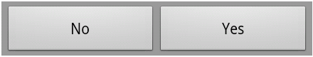
- Percentage (%)
This is the relative unit of measurement with respect to the parent container. Suppose the container is required to occupy the full width of the screen, then define its width property as ‘100%’ . Otherwise, if two horizontal controls are required, each having half the width of screen, then mark the width property as 50% for each control. This is figuratively shown in the image below when two buttons are labeled with ‘No’ and ‘Yes’.
- Calculation
Another method is adopted when the size of the control doesn’t matter, but we want a certain number of controls to be displayed on the screen. Here we calculate the size of the control by dividing the height/width of the screen with number of controls required. For example, if there is a screen with certain resolution and you need five controls to be displayed vertically. Then I would capture the height of the device with ‘Titanium.Platform.displayCaps.platformHeight’, which would return the height of the device (in points, not necessarily in pixels). Afterwards, divide the result with 5 for five controls.
- Print Typography (pt)
This unit is the same as what we follow in printed article and they represent the printed points on the paper
By way of a code example, you can see how these units work. However, there is no restriction on mixing these units.
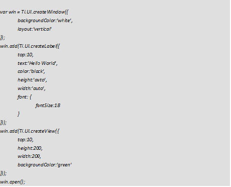
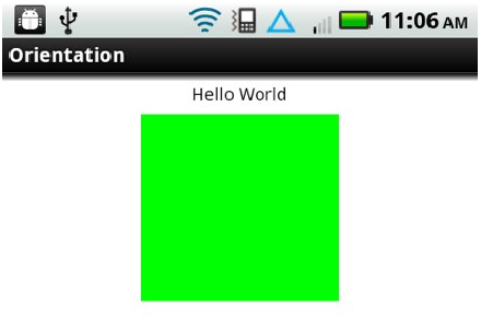
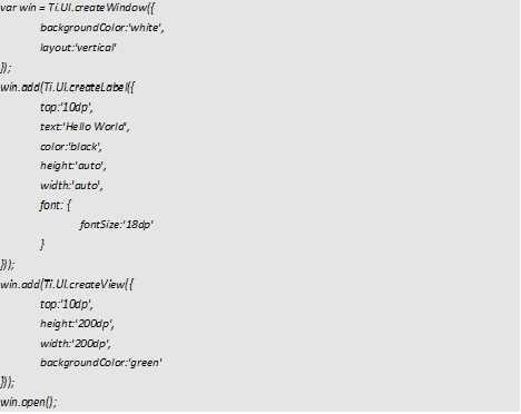
The above code will create a window and add a label above a green box with a height and width of 200 pixels. HVGA screen is here used for demonstration. You can find that the box looks very small when compared to the device’s width and height.
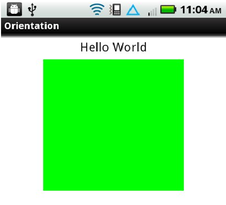
The above issue can be resolved by altering the code as given below.
The box becomes larger even when it is used with the same measurement, as shown below.
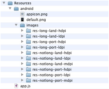
Along with the position and size of the controls and views the size of the images to be displayed on the screen should be taken into account. The native developers can use ‘Draw 9-patch’ on their images. In the Titanium framework, different images are used for various screen densities. Titanium developer just need to fix the right size in the right folder and the Appcelerator Titanium framework ensures the right image is displayed on the device. There is no need to write a separate image path.
If you want to keep the image in a subfolder, you can use it in "Resources/android/images/<density folder>/subfolder/test.png" and refer it in the app as "image/subfolder/test.png". These folders are searched for images from the most specific to the general. You can create a folder titled "res-mdpi", if an image doesn't exist in one of the other folders it will look there for it last before it fails to find the image. It is the default folder. For simplicity using "high", "medium", and "low" is the same as using "res-hdpi", "res-mdpi", and "res-ldpi".
Below is the diagram showing the specific folders we can have to store our images. Once again there is no need to mention the long directory names in our app.
Related Articles
Top Python Web frameworks
Django is a very nice Python Web framework that was developed about 4 years ago to encourage rapid development. The Python web framework also compliments clean, pragmatic design an…
Read More →Key aspects for Enterprise Cloud Architecture and Enterprise Mobile Solutions
Cloud computing is a shared service that provides users access to the IT infrastructure distributed through an enterprise network or internet. It involves the deployment of applica…
Read More →5 things to make your site efficient with Drupal development
In the cloud, mobile and digital era, finding the right platform to publish and share content is critical. Making the decision around the right web platform and web content publish…
Read More →Subscribe to the Creatrix Blog
Fresh insights on higher education, straight to your inbox.
We respect your privacy.
Want to contribute?
We welcome thought leaders to share ideas and write for our blog.
Become a Guest Author →