Responsive Design for Smartphones and Tablets


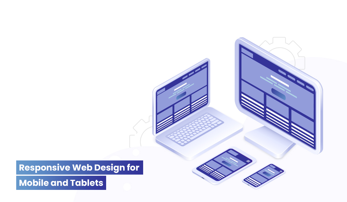
Responsive web design enables a website to customize to the screen size of the device automatically and deliver unique browsing experience in multiple devices. RWD is built on the principle of designing and developing websites to respond to users’ behavior and the environment – website or mobile. Responsible design is optimized to screen resolution, device and user behavior. It improves user experience of the website viewed on your smartphone or tablet, and creates a huge impact in cross-platform development. The responsive design makes a world of difference with its personalized and enhanced user experience, however, it is easy to create and implement.
Unleash the power of Drupal to deliver responsive design themes organically. Responsive design is commonplace nowadays and an Enterprise CMS system supports responsive design. With Drupal CMS you can build a site from scratch and preview your website on a mobile app or mobile website and you don’t need to zoom with a magnifying glass to access web pages on devices without modifying the content. Using the web services, modules and themes of Drupal, you can access drupal on mobile devices without editing content. Develop responsive accessibility on Drupal sites using contributed modules and themes, and through APIs and coding solutions. Drupal powers a number of higher education sites, e-commerce sites, corporate sites, and many more with specific level of responsive accessibility.
Transform the website tailored for multiple screen resolutions for mobile phones and tablets with user-friendly design taking into account of unique multi-platform user experience. Drupal responsive design theme has all the groovy bells and whistles to browse website on iPad and mobile devices.
With smartphone and tablets exploding the market, mobile browsing is fast outpacing desktops with a third of the mobile users accessing internet through mobile phones. It is wise to assume that desktop content is optimized for smartphones and tablets through mobile websites and mobile apps and responsive design delivers true enterprise mobile solutions with its look and feel, scrolling, resizing, zooming, consistent browsing experience and location-based information.
Key features
- Simple code at the backend
- Personalized user experience
- Cross browser and cross platform compatibility
- Create responsive design from scratch
- Design to a fluid grid
- Configure Mobile-first Drupal themes like square grid, Adaptive, Omega, HTML5
- Progressive Enhancement rather than graceful degradation
- Flexible images
- Responsive CSS3 Media Queries & customization
- Portrait/Landscape orientation
- Browser support
Related Articles
Top Python Web frameworks
Django is a very nice Python Web framework that was developed about 4 years ago to encourage rapid development. The Python web framework also compliments clean, pragmatic design an…
Read More →Key aspects for Enterprise Cloud Architecture and Enterprise Mobile Solutions
Cloud computing is a shared service that provides users access to the IT infrastructure distributed through an enterprise network or internet. It involves the deployment of applica…
Read More →5 things to make your site efficient with Drupal development
In the cloud, mobile and digital era, finding the right platform to publish and share content is critical. Making the decision around the right web platform and web content publish…
Read More →Subscribe to the Creatrix Blog
Fresh insights on higher education, straight to your inbox.
We respect your privacy.
Want to contribute?
We welcome thought leaders to share ideas and write for our blog.
Become a Guest Author →